
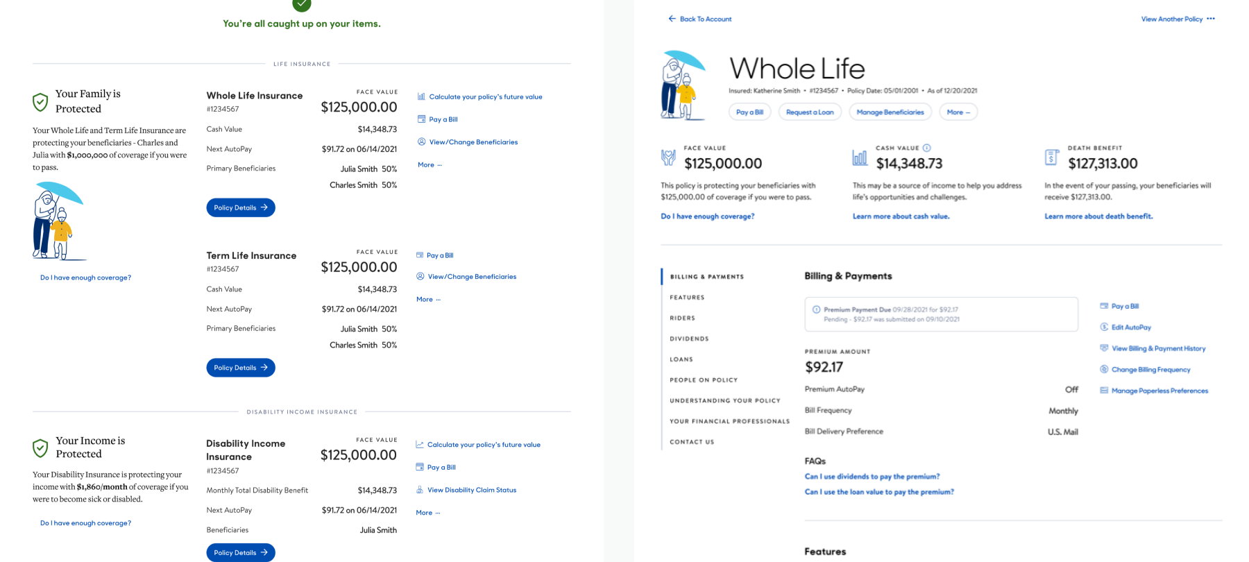
A Customer can view all their products and policies online in the authenticated space.
I participated in the end-to-end dashboard redesign process while collaborating with another designer, led the product/policy redesign process, and continued working with Product Owners and engineers.
The previous dashboard UI did not share much with the user. So the team and I, along with the other designer, strategized to create a new dashboard design to make the experience more user-friendly. I also wanted to extend the same experience to MassMutual's policy and product pages to keep it consistent, provide navigation relief, and elevate the experience.
The challenge was to convince stakeholders to migrate to this new design that would provide customers with an experience that would give a high-level overview of their entire account.
The data team shared some statistics that led us to think about making the UI more intuitive. We looked at the heatmaps and funnels of the existing experience and decided on our next steps.
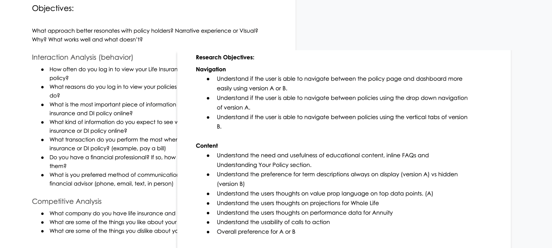
I wanted to identify the more profound needs of our customers to create a set of opportunities we could prioritize. We then partnered with the research team to create a study guide.
I also worked on a competitive analysis alongside qualitative research to create a competitive edge.
After the research, I validated the hypothesis that customers would prefer having more visibility of their accounts on the dashboard. They would also like to have more visibility on their policy/product pages and align with the new design.
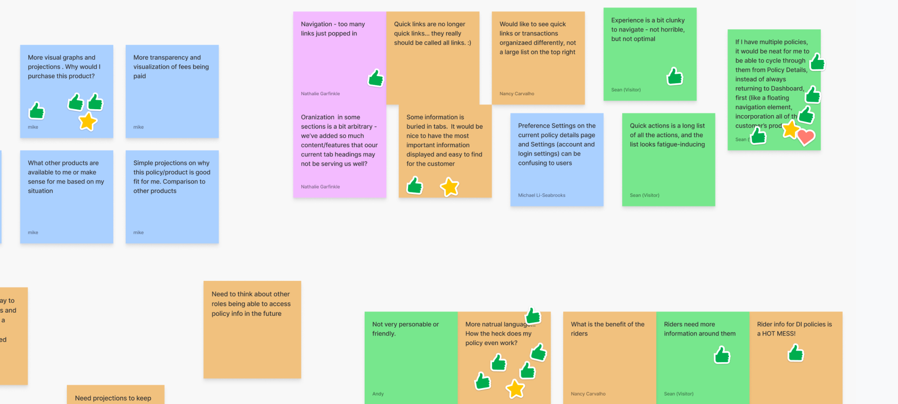
Comparing analytical data with the key insights from the study, I conducted a workshop to facilitate rapid idea generation. It was a series of brainstorming sessions for the dashboard, followed by the policy/product pages.
Later we shared the ideas with our stakeholders to align with their expectations.
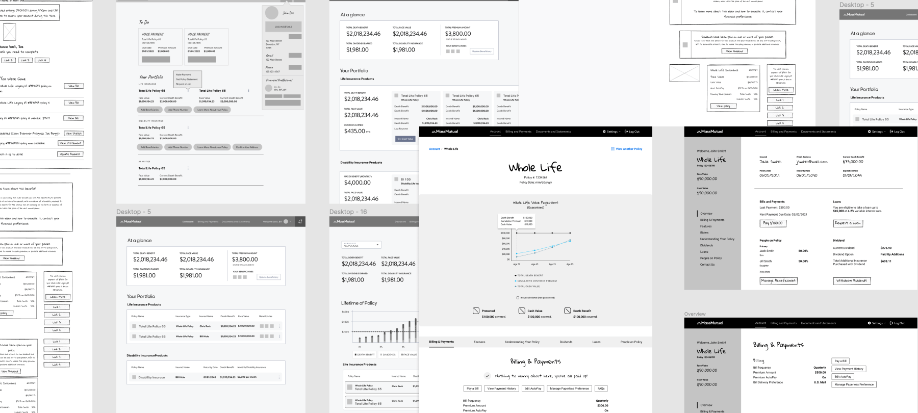
We then created a bunch of wireframes with creative solutions based on the insight sheet. It was a highly iterative process that went through various evaluations. Finally, we ended with two directions for the dashboard and policy/product pages.
I connected with the PO and engineering team to share our objectives and expectations for the usability study. This alignment allowed them to get a headstart in project development based on some outlined goals.
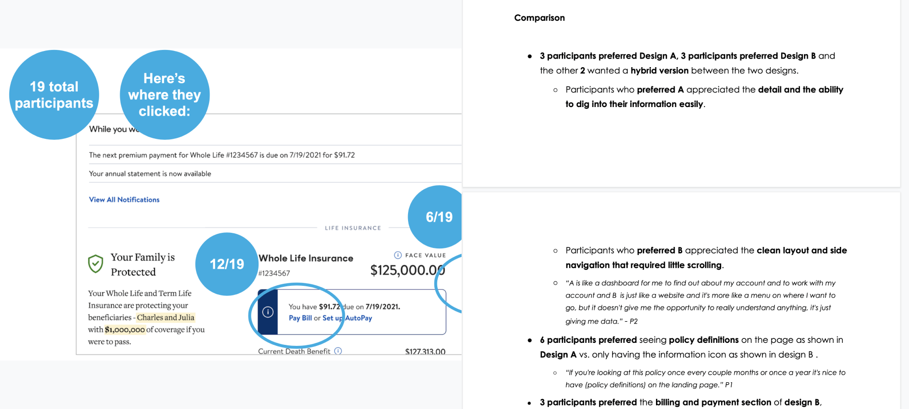
The concept designs were different, but the data was the same, which gave the team a sense of purpose and drive for the upcoming work. At the end of the study, there was a clear direction that we pursued.
Since the design had a very different visual language than the existing UI, there was a need to create a brand new Design System. I collaborated with multiple designers to create a Design System that will be used for all other projects in the authenticated space.
We continued validating our visual designs. After the first iteration and a usability study, we validated the hypothesis that users would prefer having more visibility on their dashboard followed by the policy/product pages.
Later, we continued monitoring the data and making minor tweaks to the design. I also continued migrating the legacy designs to the newer Design System.

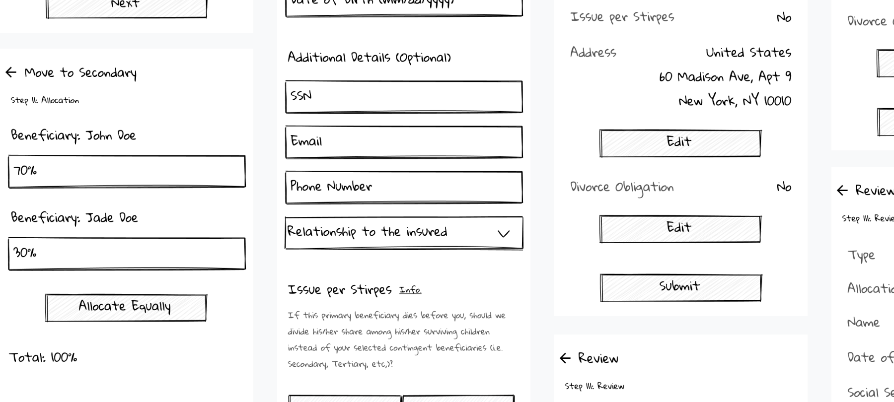
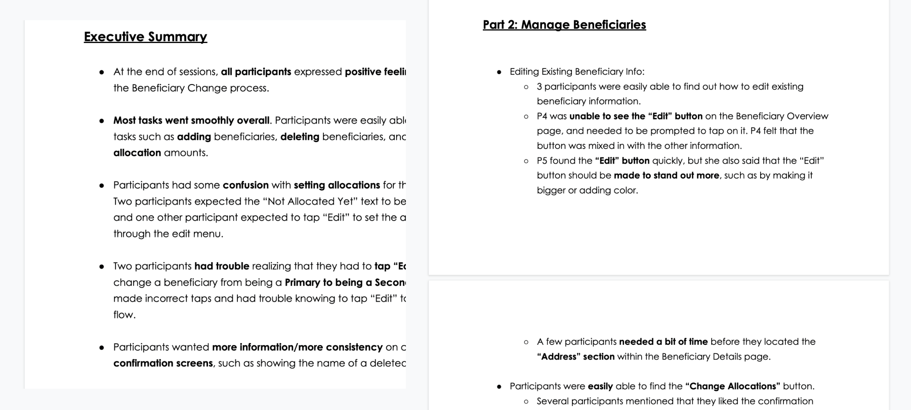
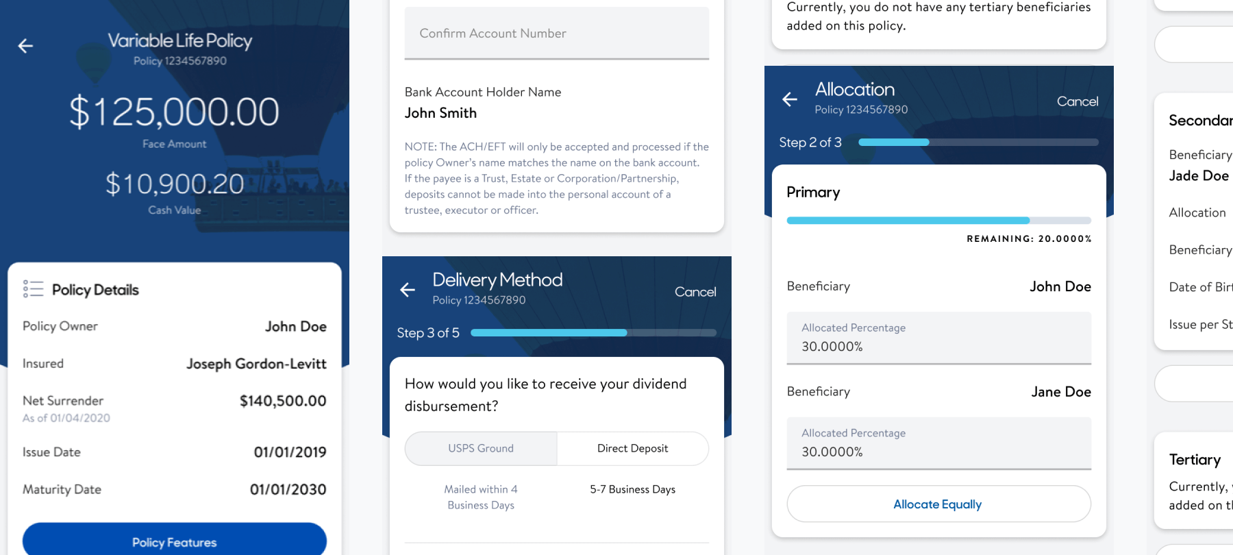
MassMutual app helps customers manage their Life insurances and Annuities' details in one place. Customers can handle payments, review balances, pay down premiums, review policy info, change beneficiaries and much more!
As a product designer, I led the end-to-end design effort, identifying research and UX strategies to visual design and VQA.
Two years ago, MassMutual had a digital presence only on the web. I was appointed as the lead designer to create a mobile experience that supported the web.
The main challenge was to translate the web experience to mobile. The hypothesis was customers would prefer to have easy access to their insurance and annuity products on mobile.
I wanted to break the entire experience into manageable chunks, so I started by learning more about the web experience even before I dove into identifying the need for mobile.
I created a moderation guide that included the goal, hypothesis, and questions. I then collaborated with the research team, who conducted the interviews and helped generate insights. I also created a tentative structure based on the web and did a competitive analysis.
I wanted to make sure we align with the web yet enhance the experience for a mobile experience. So, I did a heuristic analysis and created a priority list.
I worked closely with the product owner to align the user expectations with app roadmap. We had to hash out user and business priorities and make something we could agree on.
After the team alignment, I scribbled some ideas to get the flow right. Initially, I began to map the overall web experience and instigated it to the mobile experience and drafted wireframes to support it.
As the engineering team continued building the product, I conducted usability studies to ensure the future experiences get validated. I had to identify a research method to get the best possible insight depending on the UX. After looking at the insights, I triaged the experience and created well-defined designs.
It all comes down to the final UI and how the entire research is brought to fruition. I followed a design guideline for mobile to create a design system and use those components to define the final visuals.
On July 20, 2020, MassMutual launched MassMutual App. It started as a lean process, thereby quickly adopting and launching new features almost every quarter.
The app successfully achieved the goal to be consistent with the web while making it unique as a mobile app.
Since the redesign of the web experience, I realized a need to align with it. In addition to that, I also recommended we cater to our customers by targeting the future objectives identified in a brainstorming session.
Creating a conversational IVR experience that would support MassMutual products/policies and enabling customers to complete transactions in the IVR. I started with competitive analysis, convinced the team to move from traditional to conversational IVR, and later discussed adding Annuity Product support with stakeholders by conducting interviews to identify the need.
Massmutual's vision for paperless is to make all the documents available online. I collaborated with the product team to create strategies for user acquisition and end-to-end experience - identifying existing experience drawbacks, wireframing, and user study. I also worked with other teams to find the best locations to promote paperless.